


01 | Overview
What is Green House?
Green House is a Korean restaurant in Argentina that operates exclusively as a pickup service. They have no online menu or ordering system, so customers have to call in to check dishes, prices, and place orders. I designed a mobile app to simplify that process, from browsing the menu to coordinating group orders.
02 | Problem & goals
Friction when placing orders
The restaurant currently lacks an online menu and ordering system, forcing customers to call to ask about dishes and prices and place orders, which makes the process lengthy and complicated.
The main objective of this project was to create an app that would facilitate communication between the restaurant and its customers while simplifying the current ordering process.
03 | Research
Understanding the landscape
I conducted a competitive audit of existing food-ordering apps to understand common patterns and best practices.
I also interviewed four people, finding that the primary users represented a diverse age range, typically from their 20s to 50s, who either lacked the time or ability to cook regularly.
Key pain points:
Difficulty placing large group orders efficiently
Challenges in identifying suitable dishes for people with dietary restrictions
Difficulty determining the optimal time for food pickup to ensure timely arrival


04 | Design
From insights to ideas
Based on the research, my initial design focused on providing the following:
Give customers full, easy access to the menu
Support group orders
Make dietary restrictions and allergens easy to identify
Let customers schedule pickup at a convenient time
I started by sketching multiple paper wireframes. Next, I selected the elements from the paper wireframes that best addressed user pain points and created a low-fidelity digital wireframe and prototype.


View full design in Figma
05 | Evaluate
Testing the first draft
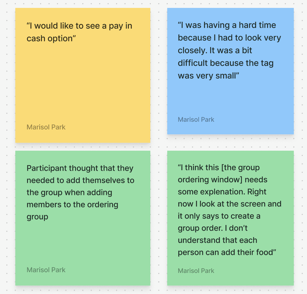
Tested the low-fi prototype with five users and found that:
Users were confused by the group ordering feature and how it works
Some users had difficulty seeing the dietary restriction tags
Users wanted a cash payment option (common payment type in Argentina)
Some users mentioned wanting the option to pay in full or split the bill
06 | design
Refining the experience
Using this feedback, I refined the design. Some of the new implementations in this design include:
Increase visibility for dietary tags
Option to pay in full or split the bill

07 | Evaluate
Testing the second draft
I tested the design with five users. The key insights were:
Most users understood the group ordering feature and how it works
Users had difficulty understanding how to edit the ordering group
08| Design
Final app deliverable
I incorporated this last round of feedback into a finalized high-fidelity prototype, refining the group-editing flow for clarity.
09 | Reflection
Key Takeaways
I learned how to design for the unexpected. During User testing users repedetly interacted with the interface in unexpected ways. Each round pushed me to rethink my design to improve it, reinforcing the importance of testing and iterative design to build intuitive interfaces.
Good design have to account for the context in which it will be used, not just the general best practices (for example, adding a cash payment option for a restaurant app in Argentina).
10 | Next Steps
Next Steps
More usability studies to identify additional areas for improvement.
Work closely with the restaurant to make it easy for them to update their profile, combos, and menu items
