NASA Soundscapes Apprentice Page Redesign

Role
UX designer
Researcher
Duration
2 weeks
Tools
Figma,
01 | Overview
UX design class Soundscape website redesign
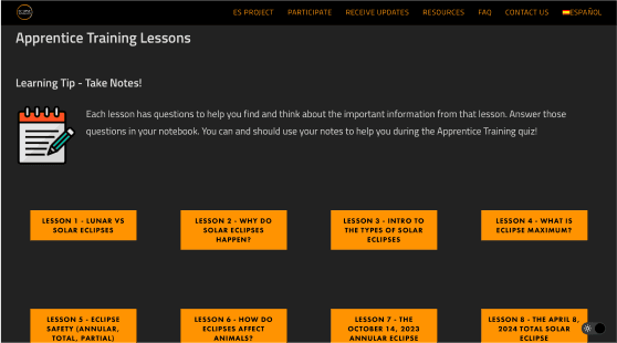
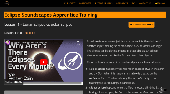
This project was done as part of a class assignment, working directly with real members of the Soundscapes team as our client. They asked my team and me to rework the UX of their 'Apprentice Training' page, with the goal of attracting a younger audience (ages 13-30.) The catch was that whatever we designed had to be buildable in WordPress. The goal wasn't just to make the page look better, but to make it more appealing and engaging for a younger target, without losing the educational core of the content.
02 | Research
Initial research
We talked to two members of the Soundscapes team directly and interviewed six users between 13 and 30 to get a better understanding on what wasn't working. What we found was:
Users instinctively looked for a navigation bar or header. Right now, there is none
The long scroll made the page overhwelming and hard to navigate
Combining that with our competitive analysis, we ran everything through a 2x2 matrix to figure out the focus areas that would have the most impact.

03 | Design
From insights to a first design
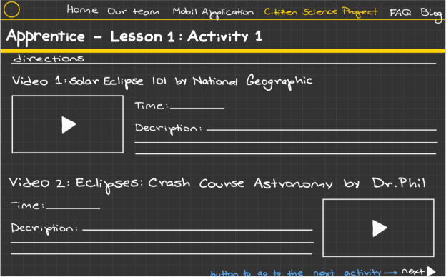
With that direction set, I created wireframes, working within the client's goals, the user feedback, our research, and WordPress's limitations.
The design broke the content into separate tabs and gamified the training section to make it more digestible.


04 | After world
What happened after
Our time working directly with the Soundscapes team wrapped up once we presented our ideas, most of what we recommended ended up showing up in their actual, live 'Apprentice Training' page!