

TikTok Ad & Sponsorship Disclosure Redesign

Role
UX designer
Researcher
Duration
4 weeks
Tools
Figma, Figjam
01 | Overview
UX design class app redesign
This project was done as part of a class assignment focused on redesigning an existing digital product.
TikTok's current method for disclosing ads and sponsorships is deceiving to its users, especially its younger audience. My goal is to create a transparent experience that allows users to easily identify when the content they interact with is an ad/sponsorship. While some might argue this contradicts business interests, I believe it will foster and maintain audience trust, ensuring the platform's long-term success.
02 | Problem
What's the problem?
The current disclosure method in the app shows up as a low-contrast tag, tucked into a low-priority spot in the visual hierarchy. On top of that, many creators choose to not disclose their partnerships by skipping the tag and talking about paid products like they're personal favorites. This is highly deceptive for TikTok's younger teen audiences, who make up 25% of the user pool (largest demographic).

03 | Research
Initial Research
Interviews
In addition to mapping the user flow of TikTok's disclosure system, I observed, interviewed, and created user journeys for six individuals to identify pain points. I found that:
Some users caught ads and sponsored content right away
Others missed them entirely
A lot of people scroll fast
People were frustrated by how often they were running into undisclosed ads
Competitive analysis
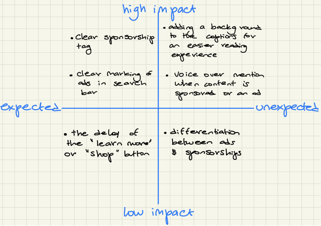
I also looked into other platforms' disclosure methods. YouTube stood out, it does a great job flagging ads and sponsorships while mantaning profitability.
04 | Design
From insights to a first design
Following, I built out a low-fidelity wireframe for the redesigned disclosure system. It introduced a disclosure tag in a more visible color and placement, and made sure that the tag also showed up clearly in search results.

05 | Evaluation
Testing the first draft
I tested the wireframe with six users, and the feedback was mixed and reveled that:
The tag placement successfully reflected when a video was an ad/sponsorship
The color red in the tag conveyed a sense of danger or warning
The difference in color between the 'Learn more' button and the tag made users believe that they were unrelated.
06 | Design
Refining the experience
Taking that feedback into account, I built a high-fidelity prototype that:
Matched the color and shape of the sponsorship tag to the "Shop" or "Learn More" button
Increased the caption text size and added a black background box behind it to make everything easier to read at a glance

07 | Evaluation
Testing the second draft
Testing with 6 users showed that:
The larger text and darker background for the captions increased readability
The color of the sponsorship tag had good contrast against the clips playing behind it, but the text inside was hard to read
The 'Shop' button was too distracting and diverted the viewer's attention away from the content
08 | Final design
Final design

08 | Next Steps
Next steps
Track how more transparent disclosure actually affects user interaction with the platform over time
Run further testing with a more diverse group to get a fuller picture of how this lands
Make it easier and clearer for creators themselves to add the sponsored or ad tag, which would mean another full round of research, ideation, wireframing, testing, and prototyping
